Hi fellow Blue Fern Fans, today will be my last series for Blue Fern Studio. Due to some unexpected work changes, I am required to do lots of business travel, this is has the impact of reducing my craft time and I've had to make the heartbreaking decision to leave the amazing Blue Fern Studio creative team. I hope this last production will inspire you with the amazing Blue Fern Studio Products.
Layout #1: Travel
My first layout this month is inspired by the amazing Tattered Wall grunge feel paper of The Garage. It is amazingly perfect for making boy layouts, I just fell in Love with this paper.

Have you seen this new Azul embossing powder? It is spectacular. Perfect mix of turquoise and silver.

The ephemera are so much fun to use, it makes the perfect small elements around your picture.

Blue Fern Studios Products Used:
Paper:
Tattered Walls The Garage
Tattered Walls Ephemenra
Flowers:
Harvest Lilies
Embossing Powder: Azur
Chipboard:
Wanderlost Words & Frolic Mesh
**********************
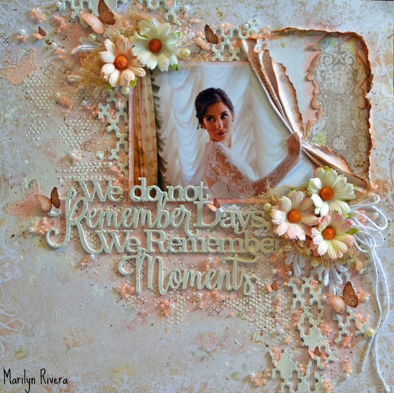
Layout #2: Love
Oh what can I say, it's so easy to be inspired when you get the chance to work with an amazing baby photo like my friend's daughter, she is just adorable. Happy Accident remains one of my favorite collections. I love the detailed print on this background. On this layout, I wanted to created a soft vintage feeling so I opted to play with lots of flowers and embossed chipboard.

Frame chipboards are my favorites, I love using them under my pictures to create dimension. Embossed in rose gold, this one gives the softness I was looking for with a twist of shimmer.

Touched of Lace add to the delicate feeling of the page

I love this flower with a pearl center, just perfect. I also enjoy adding lace in my layering of the flowers.

On this dangle chipboard, I opted to use 2 different embossing powders : Baby Pink & 14 karat

Blue Fern Studios Products Used:
Paper:
Happy Accident
Flowers:
Heartland Blooms
& Apricot Blooms
Embossing Powder: Baby Pink, 14 karat & Rose Gold
Chipboard:
Frame & Dangling butterfly
Lace: 10 & 4
**********************
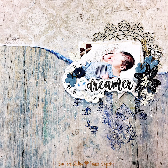
Layout #3: Dreamer
Sweet Sweet Sweet baby, I just love this amazing picture of my friend's son Jack. This layout was just too fun to do.
The Tranquility collection was just what I needed, it breaths calm and tranquil, perfect for this baby picture.

The Widget stamp is so much fun for a boy layout, I just enjoy the gears. I also enjoy embossing on my layout,

A bit a lace, a few flowers and the delicate ornaments are a perfect touch for this baby boy layout.


Blue Fern Studios Products Used:
Paper:
Tranquility Calm & Peaceful
Flowers:
Dark Tropic Lily
Embossing Powder: In the Navy
Stamps:
Widget
Lace: 4
I hope you enjoyed my last projects for Blue Fern Studio and I wish you an amazing crafty July !
Before I go, I'd like to say a special thanks to Valerie & Leslie for the opportunity to have been part of the amazing Blue Fern Studios design team. Blue Fern Studios has been and will always be one of my favorite brands for papers, embossing powders, chipboards and many more products. I wish you and the team amazing success for the many years to come.