Showing posts with label Seaside Cottage Paper Collection. Show all posts

Wednesday, October 20, 2021

Fun in the Sun Scrapbook Layout

Happy hump day Blue Fern Fans!  Today I have a layout using the Gorgeous Seaside Cottage collection!  I'm in love with this collection,  the designs and colors are so amazing and fun to create with!

I created some background texture using Blue Fern Studios Knotted Stamp and the Netting stencil.  

I used some of my leftover diecuts from a previous layout to create my layers.  I also cut out banner pieces and tags to create my design. 

I used paper doilies,  crocheted doilies  cheesecloth,  flowers,  and lace for this layout.


If you've gone on vacation to the beach,  be sure to use this collection to create your memories!  We would love to see your beautiful creations using any Blue Fern Studios products,  be sure to share on Facebook at Blue Fern Fanatics!

Thanks for stopping by!

Happy Creating!


Wednesday, December 28, 2016

~ Designer Favorites 2016 ~

Have you ever created a project that instantly became a fave? Maybe your photo spoke to memories past, or your new art supplies really got the creative juices flowing or even the mood you were in  as you created.  But somehow, it became a fave. 

Well, we decided to ask our Creative Team to show us THEIR favorite Blue Fern Studios project for 2016! 
They all agreed it was very hard to choose! 
But here is what they finally settled on  … 


Here's what Nicole said about her choice:

"I chose this layout as my favorite Blue Fern Studios DT creation because frankly, it is one of my all-time favorite any DT creations! But of course, Blue Fern Studios is the reason why it is so special. I am in love with woodgrain pattern and this one from the Tranquility collection with its teal blue tint is just gorgeous. I love the softness and serene feeling that this layout evokes with a very simple photo and a very inspiring quote. Every time I take a look at the chipboard focal piece, La Plume, I get a sense of peace and hope."


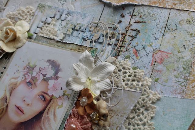
Designer Keren Tamir is a master at doing beach themed projects! Give her some blue and green and she's happy! Here, she took one of our Seaside Cottage papers and created this amazing calm and peaceful scene! Her chipboard choices are exquisite and replicates the ripples of the ocean! Ah, so relaxing! 


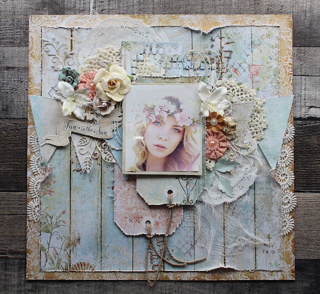
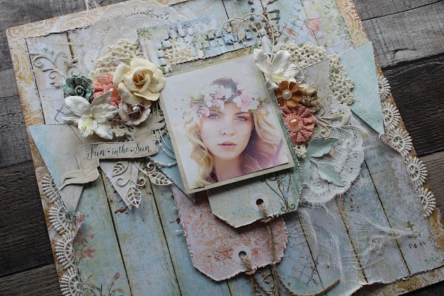
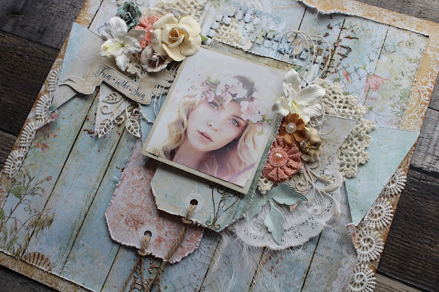
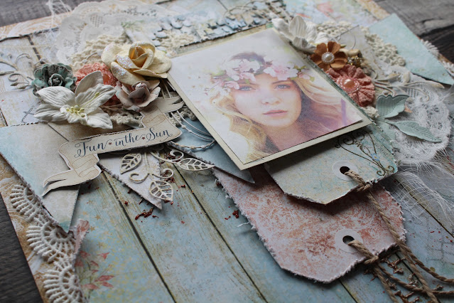
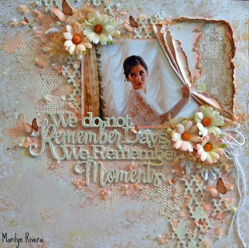
Marilyn Rivera also found it hard to choose just one project! Her background in fashion design is almost always incorporated in her layouts, most notably her fabulous pleating of her paper. Here, it seems the bride is pulling aside a curtain. Marilyn likes to frame her photos with embellishments, flowers, stenciling, ink and pearls. This is also a favorite photo of hers. 


Just one peek at this beauty and you can see Renae Harrison's love for mixing unexpected textures together.  The feminine photo, flowers, pearls and lace work beautifully against her rolled paper pieces, twine and wood sprigs. The chipboard was left almost natural to blend with her theme. 


Pascale is a master at making her photos the focus of her layouts. Here she has taken a vintage photo and clustered it with chipboard and flowers while still allowing the paper to shine! We adore the unique circular design. We will miss her amazing sneak peeks of her chipboard alterations. 


Here's what Debbie had to say about her fave:

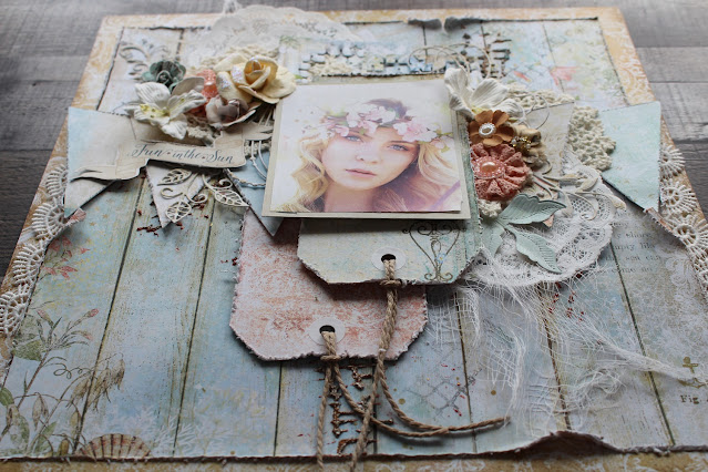
"Here is my favorite from the Seaside Cottage Collection. I wanted to use the picture of my friend's daughter walking on the beach. Everything on this layout came together perfectly. Love the soft colors of the papers, flowers and embossing powders on the chipboard."


Cathi O'Neill is a fan of our older Ombre Dreams collection and it worked perfectly for this beach photo of her daughters! Her cluster of chipboard, flowers and shells are perfect accents. We love that she's including some stamping to create more dimension. Great choice! 


Here is what Karine told us about her "second favorite" project:
(Her actual favorite was recently used in her December post, so she chose another.) 

"I love this layout because it has everything I love about scrapbooking: memories, texture, chipboards, flowers and beautiful colors."


Marie-Eve had this to say about this layout of her sweet baby:

"It is My favorite because of the Mémoires collection That i just love!  It also included some texture chipboard , my favorite ones. Finally, It is a picture of my precious baby boy."


Elena Volchkova- Ukraine 


Elena also had a hard time choosing but finally settled on this one. Her style is always soft in texture but she often includes a few bright pops of color as she does here. You might notice this paper is that same one that Cathi chose. 


Sandi said:

"I finally settled on this layout as my favorite because I loved the grunge-y photo of my youngest daughter and took my inspiration from it. I had so much fun altering the chipboard pieces to complement the photo and the Serendipity paper. Also, because I usually do more shabby, romantic pages, this was an artistic departure for me." 


Maja Nowak - Poland


From Maja:

"I loved making each and every one of my projects for Blue Fern Studion during my term on the team, putting my heart into every creation. So if I have to pick just one most favourite, my choice is based on the amount of fun I had while creating, measured by the amount of BFS products used for it. :) And thus my pick is the mini I made for my June post, Crazy Cousins. It marks my absolute record with 21 chipboard pieced from 14 various sets, 13 embossing powders and 23 motives from 13 stamp sets. Plus fun photos I was working with." :) 


Karolina said this about her favorite:
We agree this is an amazing piece! 

"It was so hard to choose only one, so I needed more time. Here is my favorite. I picked this one because I love a marine style and colors and all details of this layout."


Yuko Tanaka - Japan


How could one ever decide on a favorite of Yuko Tanaka? She is known for  her great use of multiple photos and unique fussy cutting placement. Here she has used one of her wedding photos as well as a more recent one taken at the same chapel.  Her white chipboard just shines against her Timeless papers.   Such a soft, feminine page! 


Jelissa Mei - Singapore - Video Educator


Video Educator Jelissa Mei always wows with her unique backgrounds and great chipboard techniques. We thought this sweet photo of her baby girl with her daddy needed to be highlighted today. Jelissa makes great use of white space (Blush) around the photo cluster to really draw the eye towards it. We will miss Jelissa's great video tutorials but encourage you to visit our You Tube channel (link on the right sidebar)  in case you missed one. 


We have had a great year here at Blue Fern Studios! 
Lots of new products have been released and thoroughly enjoyed. 
We want to thank each and every designer who has been a part of this year for all your inspiration and dedication to the Creative Team.  

Here's to a great 2017! 


SaveSave

Saturday, December 17, 2016

December's Social Media Feature and YOU!

Happy December, Blue Fern fans! 

We hope you are enjoying this special holiday Season and are finding at least a little bit of time to be creative! Today we are sharing just a few of our finds from the past few weeks! 

Remember to post your work and tag Blue Fern Studios for a chance to be featured … and just so that we can be sure to see your  creations! 


First up we have this lovely album by Aida Haron of Singapore. If you visit her Instagram account at 
@aidaville, you will find a quick video that she uploaded showing you all it's gorgeous hidden spots for photos and journaling! Great way to use Vintage Christmas, Aida! 


Kylie Kingham's posted this lovely creation on Instagram, stating that shabby chic is her favorite style! Here she has used Blue Fern Studios Memoires to perfection! You'll want to follow her on Instagram at @paper_sweetpea. Also, be sure and check out her blog Paper Sweet Pea because this gal does it all … clean and simple, shabby, planners and altered art! 


Hiromi Yasuda is a very busy scrapper and posts often! We are pleased to see her work with Blue Fern Studios products because she truly inspires. This is one of the most amazing uses of the Seaside Cottage paper collection that we have seen! She certainly has the perfect photo! The Perfect Day chipboard is a great final touch. Please follow her on Instagram at @nyanhiro.


If you have followed our Social Media posts for long, you know that we like to feature some altered art each month.  Here Aira Hashimoto has used cut files to create this amazing hot air balloon. This could be re-created with almost any of our paper collections to achieve different effects. Please follow Aira at @airahashimoto on Instagram. 


Last but not least, we have this gorgeous Frolic creation by Kathy Martin. Kathy can be found on Instagram at @pinkieto07. We love how the warm tones blend perfectly with her outdoor photos. The dangling chippy and flower cluster are wonderful finishing touches.

***

We will be back later this month featuring some our Creative Team's favorites from this past year!
We thought it would be fun to see what the designers like best!  (If you visit us on Pinterest or Instagram, you'll get a sneak peek into ALL our 2016 inspiration!) 

Next year we will be doing several Social Media posts a month, so don't forget to tag us so that we can find you! 

See you soon!  
Sandi 

Wednesday, September 14, 2016

~ Hello, September with Sandi ~

Hello, hello! 
Thanks so much for coming by the blog today. 
Sandi here with you today sharing my September creations. 
It is always so exciting to go in my scrap room and play with my Blue Fern Studios projects! 
I love being a part of this team. 


"Summer Vacation, Lucy Style"

First up: I haven't done a "Lucy" page in a while, so this old photo of Lucy fishing is perfect for using my Seaside Cottage papers. I've used both sides of the Splendor paper so that I could slit the grooves between the wood panels and distress them a bit. I've only used a minimal amount of mixed media so that the beautiful images would be dominant. Just a bit of colorizing with Cotton Candy Imagine Mist and stenciling. 


To get a uniform look, all three pieces of chipboard were treated the same way. First they were primed with white gesso, then heat embossed with a combination of Ginger and Chili Powder Embossing Powder. The large lantern from the Seaside Lanterns set got a heavier dose of Chili Powder, It was simply tucked in amongst my flowers and other paper layers.  The Harvest Lilies are new to the store and they seemed to work perfectly for this layout! 


I thought the chain and lantern would complete the corner of this page and indeed, they fit beautifully and balanced the design.  


I love the chunky look of the Summer Vacation chipboard and tried to give it a bit more ombre' look with my two powders. I left sections of the chipboard less heated for an interesting texture. 


A good close-up of the dimension you can achieve with your layers, chipboard and flowers. The photo was framed with Seaside Cottage Mermaid and Calling Cards. 

Blue Fern Studios Products used:

Paper: Seaside Cottage Splendor, Mermaid, Calling Cards
Chipboard: Seaside Lanterns, Summer Vacation
Embossing Powder: Ginger, Chili Powder
Mist: Cotton Candy 
Flowers: Harvest Lilies

***

"Fall Memories"

My granddaughter KK loves her horses! She recently sent a few photos that I'm sure she's hoping to see on some scrapbook pages! LOL I pulled out one of my favorite collections … Autumn Anthology because I knew it would work perfectly with her blue checked shirt and her horse's coat. Because I had a wide section of blue background using the Robin paper, I was able to do some simple stenciling without covering up any pretty images. The Mercantile paper is an absolute fave of mine and I've torn it into strips. It's a busy design but the colors and images are wonderful. 


I have a lot of layers of chipboard going here and it's hard to photograph because they are semi-covered with the photo layer. But I used the Mini Ring Things as a bottom left layer and also around the edges of the page. These were inked and embossed with Ginger and given a smidgen bit of Burnt Copper Glitter for shine. The next layer, other than the paper was the Flourish Medley piece which was cut in half to lengthen it. It was embossed with Ebony Embossing Powder as well as Ginger, topped off with bits of the Burnt Copper Glitter. The Collage Frame was treated the same and is directly beneath my matted photo. 


I wanted to share just a closer view of the frame and flourish pieces. They look divine in real life! 


For flowers, I combined some of the Tranquil Blooms with our Seaside Lilies. A Calling Card serves as my title. 


I'm hooked on these side views because depth, layers and texture are "my thing!"

Blue Fern Studios Products used:

Paper: Autumn Anthology Newsworthy, Mercantile, Robin, Calling Cards
Chipboard: Mini Ring Things, Collage Frame, Flouirsh Medley
Embossing Powder: Ginger, Ebony
Glitter: Burnt Copper Glitter
Flowers: Tranquil Blooms, Seaside Lilies
Stamp: Halftone

***

"Remember Moments"

This "Mermaid" paper has become the signature paper from the Seaside Cottage collection and I love it! My original intent was to use it for an old photo of my dad but that will have to come another time …. once I get more of these papers. However, I was itching to scrap this brother and sister photo taken near a beach. Photo credit to the Souza's photographer, name unknown. 

Since everyone has already used this paper, I decided to "go big or go home" and used the large title "Remember Moments." Otherwise, it's actually a quite simple page. Under my photo I've used the Crossing the Lines chipboard. Both of these large pieces were inked and treated with some old rusting powders. 


Seaside Gala and Calling Cards papers were torn and tucked under my photo and on top of the chipboard. Cheesecloth was used as a base. I'm loving how versatile the Blue Fern Studios lilies are. 


A close-up of the title and also a view of some of the random stamping. 


The stenciling is light but yet ties the theme together. Now this layout is headed off to this sister who is missing her brother while he's away on the mission field. 

Blue Fern Studios Products used:

Paper: Seaside Cottage Mermaid, Gala, Calling Cards
Chipboard: Remember Moments, Crossing the Lines
Flowers: Dark Tropic, Late Winter and Seaside Lilies, Courtship blooms
Stamp: Widgets

That's all for now!
See you next month!
Sandi

Thursday, September 8, 2016

September Inspiration With Debbie

Hi everyone, Debbie here with you today to share my layouts.  
My first layout was created for the September Mood Board Challenge.  Absolutely love the mood board with all of the beautiful colors and textures. You can find all the details of the Mood Board Challenge here.  I chose to create a beach themed layout using the Seaside Cottage collection.  I was inspired by the colors, the shells, the sun and the textures of the sand and water.

I used the Whitewash paper from the Seaside Cottage collection for my background and added some subtle inking with peach ink to pick up the colors in the sunset.  Lots of layering under my photo with  the Voyage, Mermaid (side B), Glory and Calling Cards papers.

I embossed the Blooming Flourish chipboard with a mixture of Mushroom and Sea Mist embossing powders.  Tucked beneath the flowers I used The Crackle Bits chipboard which I embossed with Snow  and In The Navy embossing powders and added some Blue Ice Glitter.  I used flowers from the Attic Charm Daisies and Tranquil Roses.

Here you can see an additional flower from the Seaside Lilies and some shells along with some micro beads on the Crackle Bits chipboard.

I love mixing colors of the Imagine Ink Embossing Powders.  On my title, I used a mixture of Mushroom, Sea Mist and Petal.

My next layout was created using the Sanctuary and Tranquility paper collections.
I found the cute vintage picture on Pinterest.  Love the angelic little girls and the pop of pink coloring added to the picture.  I used the Sanctuary Conservatory paper for the background.  I added some subtle inking with some berry ink to the background paper.  Layering under the picture includes Sanctuary Calling Cards and Tranquility Serenity paper. I cut out some doilies using the Tranquility Serenity paper.  I ripped the doilies into pieces to add some additional texture to the layout.

The Boston Lattice chipboard sits under my picture. I embossed it with some dark brown embossing powder from my stash and added some Fuchsia and Mushroom Imagine Ink Embossing Powders.

To the right of the picture I used the Garden Daisies - Large Chipboard, embossed with Mushroom and Fuchsia Embossing Powers with a touch of brown.  I used the Attic Charm Daisies and added some brown micro beads in the centers and tucked in some brown Courtship Blooms.

The title is part of Laughter, Happy, Smile. Embossed with a mixture of Mushroom, Fuchsia and Brown Embossing Powders.

My final layout was created with papers from the Deja Vu  and Love Story paper collections.
I used the Atelier paper for the background.  I added some white inking around the outer edges of the papers and some random masking of small dots around my photo. Layering under the photo includes the DejaVu Calling Cards, Tresors and from Love Story, Calling Cards.

I embossed the Floral Wreath with a mixture of Black Sand, It's A Girl and Petal Imagine Ink Embossing Powders.  I cut the wreath into pieces and placed it around the picture.  Some micro beads were added for texture.  I used Attic Charm Daisies and Attic Charm Glitter Roses.

Underneath the photo I used  a Doodle Corner chipboard, embossed with Black Sand, Its' A Girl and Petal Embossing Powders.

The title piece is from Blissful, Jubilation, Patience.  I chose Patience for the title as I thought the girl in the photo looked so patient as she stood there waiting to get her picture taken.  I embossed it with some Petal and Buttercup Embossing Powders and added some inking.

I hope I have inspired you today.
Thanks for stopping by!
. . . Debbie