Showing posts with label Frolic Mesh. Show all posts

Thursday, August 11, 2016

Nicole's Seaside Cottage Inspirations


Hello!  Nicole here with you today to share with you my August creations,
all featuring the newest Blue Fern Studios collection called Seaside Cottage!

This collection evokes such a calm, soothing Summer feel, with its beautiful sea-themed papers and lovely coordinating marine chipboard pieces.  Seaside Cottage is definitely a MUST-HAVE paper line to document all your Summer holiday memories which I have done this month.

Island Time


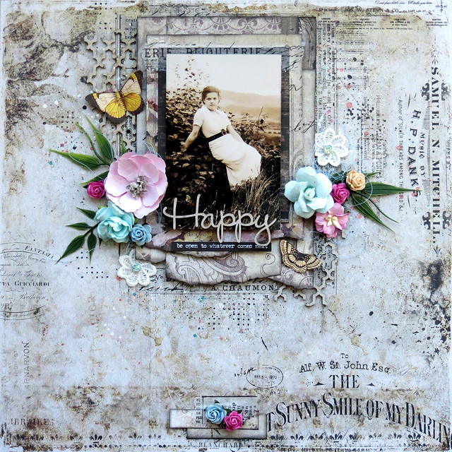
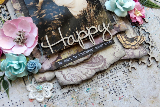
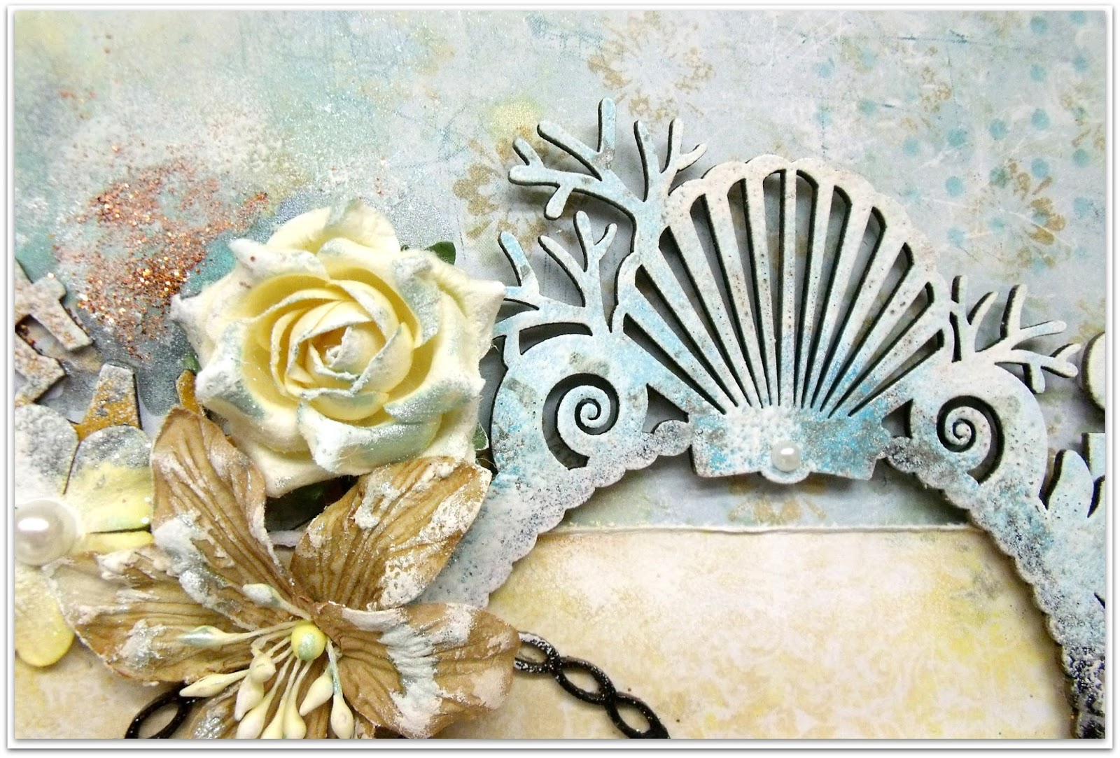
My very favorite paper from this collection is this one called Mermaid.  I have decided to use it as my background for this page featuring a splendid shot of the sailing ship L'Esperance as it was in passage in our area a few years past.  The Island Time title was perfect to go along with the photo.  I created an ombre effect on the chipboard by using 3 shades of embossing powder: In the Navy, Nutmeg and Oatmeal.


I made use of many Blue Fern Studios flowers, some of which from the latest sets designed to go along with this paper line and a few from the Tranquil set.  I added a combination of blue and copper microbeads as well as splatters of different paints to give my page a mixed media touch.


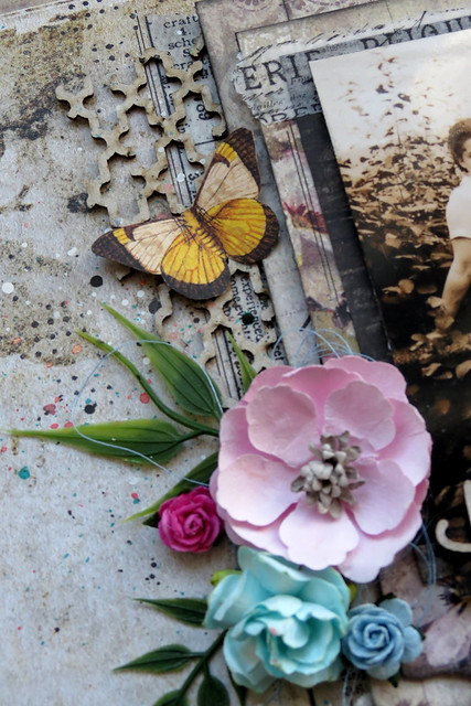
Below, you can see the gorgeous Seaside Flourish and the larger lantern from the Seaside Lanterns set.


I removed the center from the navy blue Seaside Roses to replace it with a brad and decorated my flower cluster with a Whimsy Flourish covered in Oatmeal embossing powder.


Some magnificent papers and chipboard for a magnificent photo!


Blue Fern Studios products
Patterned papers: Seaside Cottage (Mermaid, Relics, Gala)
Chipboard: Island Time title, Seaside Flourish, Seaside Lanterns, Whimsy Flourishes
Flowers: Seaside Roses, Seaside Lilies, Tranquil Blooms
Imagine Ink: Embossing Powders (In the Navy, Oatmeal, Nutmeg)


Summer Vacation


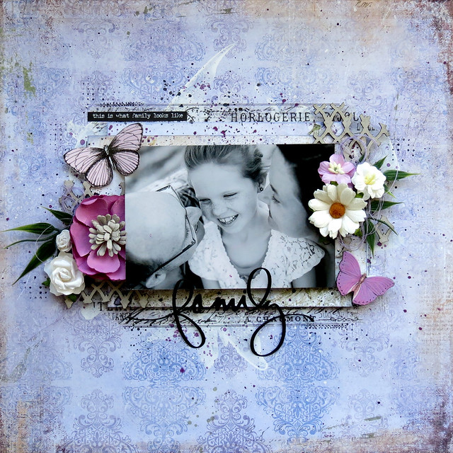
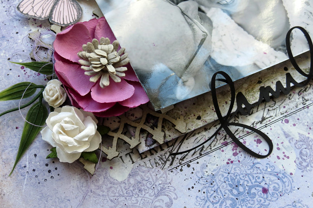
I love creating double-page layouts and I had just the right pictures for this one, to go along with these beautiful papers.  I took these shots during our family Summer vacation in Percé, Quebec two years ago.  Yves was walking on the seashore admiring from afar the famous Rocher Percé.

I choose to use the Summer Vacation chipboard piece as my title and covered it in layers of Stellar Night, Blue Sky, Breeze and Snow embossing powders.


I decorated my page with beautiful blue Seaside Lilies and ivory Seaside Roses along with other flowers from my own stash.  I added pieces of Crackle Bits, covered in Auburn embossing powder, behind my flower clusters to give the illusion of fishing nets.


This is a fabulous new piece called Seashell Frame which I decide to cut in half... using the top half on top of my photo strip and the bottom half peaking out from below.


I sprinkled a little Autumn glitter around my flower clusters and I added some white and blue shimmery paints on my background and embellishments as well as turquoise mist.


I absolutely love this quote to go along with the photos of Yves... 
a boy playing on the sea-shore... :)


Blue Fern Studios products
Patterned papers: Seaside Cottage (Splendor, Voyage, Gala, Calling Cards)
Chipboard: Summer Vacation title, Seashell Frame, Seaside Lanterns, Crackle Bits
Flowers: Seaside Roses, Seaside Lilies
Stamp: Essential Textures
Imagine Ink: Embossing Powders (Stellar Night, Blue Sky, 
Breeze, Snow); Glitter (Autumn)


The End of a Perfect Day


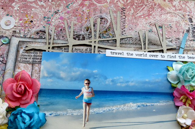
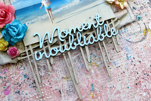
My final layout this month features a super sweet photo of my niece Ella standing ashore, at the end of a perfect day, just before sunset. I used the Icicle embossing powder on the title with a bottom layer of Chili Powder which I found was perfect to go along with the color of the sand on the picture.

Wanting to showcase as much different patterned papers on my layout as possible, I created several tags and slipped them along the ripped and distressed diagonal edge of my page.


Below, you see a piece of the Frolic Mesh covered in Seamist embossing powder to adorn the Blue Fern Studios blooms.


This gorgeous image from the Calling Cards paper went beautifully with my photo and page.
I lined it up with some fussy cut shells and the dolphin from the Ocean Mermaid set.


Also from the Ocean Mermaid set is this fabulous piece on which I used, from the tail tip to the bust, Clover, Peacock, Seamist and Icicle embossing powders.


Oh, how I love this picture!  It seems like the perfect end to my reveal today, showcasing the gorgeous Seaside Cottage line! I hope you have enjoyed my 3 sea-themed projects just as much as I've enjoyed creating them.  I have to say that this DT reveal is my favorite of mine so far.


Blue Fern Studios products
Patterned papers: Seaside Cottage (Whitewash, Regalia, Gala, Calling Cards)
Chipboard: The End of a Perfect Day title, Ocean Mermaid, Frolic Mesh
Flowers: Seaside Lilies, Attic Charm Daisies, Tranquil Roses & Lilies
Imagine Ink: Embossing Powders (Seamist, Clover, Peacock, Icicle, Chili Powder)


Thursday, April 21, 2016

Three layouts by Marie-Josée

Hello, Blue Fern Studios fans!

Today, I am featuring three layouts created with the latest three Blue Fern Studios paper collections: Courtship Lane, Serendipity, and Timeless.

Happy (Timeless collection)

For this layout, I used the Timeless collection. I have to admit that this one is my all-time favorite BFS collection! I used a picture of my grandmother, taken in 1936.

As you can see, I created many layers under the picture with various Timeless papers. I used the Artistic paper for the background.


You must have notice that I love the look of bare chipboards on my layouts. Here, I also used bare chipboards from two different sets: two pieces of the Turkish Bits set, and the word Happy, from The Optimist Word Set.


Moment inoubliable (Serendipity collection)

For this layout, I used the Serendipity collection. For the background, I used the Glee paper.


Under the picture, I used the Crossing the Lines chipboard, which I did not alter.
 

For the title, I used two words from the French Words set, Moment and inoubliable. I altered them with Blue Fern Studios embossing powder. I used the color Breeze.


Family (Courtship Lane)

Unlike many people, I LOVE purple! Thus, I was really happy when Blue Fern Studios introduced the Courtship Lane collection, because it has lots of purple.

I used the West Plaza paper for the background.
 

Under the picture, I used pieces of chipboard from the Frolic Mesh set.


That's all for today! I hope you enjoyed my projects! :)

Monday, April 11, 2016

From Romance To Grunge by Nicole Doiron


It's me Nicole and I am thrilled to be back with you to share some of my creations.
I have 3 layouts to show you today, going from romance to more romance to grunge!

Let's start with this one... soft and elegant.... using the Courtship Lane collection.


I stamped some of the tiny dot stamp from the Halftones set and
used Imagine Ink Snow embossing powder to add texture to my background.

It's no surprise that one of my favorite themes to scrap is love. And so this title Amour from the French Words set, was perfect for this picture of me and my man!


The majestic chipboard piece below is French Ironwork.  I covered it, as I did to the title, with Mystic Plum embossing powder, then frosted it with a little white.


The smaller flowers used are from the brand new BFS Courtship Roses and Blooms set.  They're beautiful!


Bordering the photo is one of the Leafy Page Accents. and some fussy cut flowers.


Blue Fern Studios Supply List:
Paper: Courtship Lane (Lover's Lane, Bourbon Avenue, East Plaza, Calling Cards)
Chipboard: French Ironwork, French Words, Leafy Page Accents 
Stamp: Halftones
Imagine Ink Embossing Powder: Mystic Plum, Snow
Flowers: Courtship Roses, Courtship Blooms

***

My second layout is quite similar in style to the first one .


I chose a combination of papers from the Sanctuary, Love Story and Frolic collections.
That is just one of the many things I love about Blue Fern Studios papers... no matter the collection, they are all so versatile and work together very well!

Creating part of my title is the word 'Happy' from the Optimist Word Set... I simply painted it red.
Then, dangling from the bottom of my picture is the Mini Frame Dangle which I cut in two pieces and covered with Imagine Ink Oatmeal embossing powder and white paint.  In the frame, I put a piece of red Frolic paper and added some Fire Engine glitter to give it a little sparkle.


The other piece of the Mini Frame Dangle I used on the left side of my page as a flourish sneaking up from the mini prints.  You can see glimpses of Garden Frolic stamp on my background.


Included in my flower clusters are the beige Courtship Blooms.  I sprinkled some more Fire Engine glitter in and about the flowers.


And last but not least, you can see some Frolic Mesh treated with Ebony embossing powder.
The picture is of Yves and I on one of our very first dates, which was already 10 years ago!


Blue Fern Studios supply list:
Paper: Sanctuary (Birdsong Melody, Calling Cards)
Love Story (True Harmony)
Frolic (Calling Cards)
Chipboard: Optimist Word Set, Frolic Mesh, Mini Frame Dangle
Stamp: Garden Frolic
Imagine Ink Embossing Powder: Oatmeal, Ebony / Glitter: Fire Engine
Flowers: Courtship Blooms

***

Now let's get down to the grunge part of this reveal!


This last layout today was inspired by the Blue Fern Studios April Sketch!


Ever since I started designing for Blue Fern Studios, I have been holding on to these particular chipboard pieces and was so anticipating creating the perfect boy layout.  I'm not sure if this layout is anywhere near perfect, but I have to say that I really love the way it turned out.

I started off a background paper from the Love Story collection and then covered it with blue and black mists as well as dabs of metallic blue paint and splatters of white.  I also did some black stamping using the Journey and Texture Set One. You can see here the title Boy Meets World which I embossed in Cerulean Imagine Ink embossing powder and lightly dabbed with more blue metallic paint.


For sure two of my favorite BFS chipboard pieces are the Techno-scape and Working Parts!  I love anything grunge and steampunk even though not my usual style.  On these pieces, I used Icicle embossing powder and then added some light dabs of blue.


Other chipboard used are two circle arrows from the Directions set, embossing with Ebony.


This gorgeous little boy is Tristan, my friend's son.


Blue Fern Studios Supply List:
Paper: Love Story (The Grand Ball)
Chipboard: Boy Meets World, Directions, Techno-scape, Working Parts
Imagine Ink Embossing Powder: Cerulean, Ebony, Icicle
Stamp: Journey, Texture Set One

Hope you enjoy! 
I would love to read your feedback in the comments!

Wednesday, October 21, 2015

Bentes October projects.


Hi there.
Today it's my turn to blog some Blue Fern goodness and to start with I have a page that I made
with the lovely Autumn Anthology. 


I used the Robin paper as a base and the Cottage paper on top.  I used a brayer to add a thin layer of gesso to prime my paper for the Imagine Ink Sky mist and the Love Story 2 stamp set.


I cut a piece from the Shabby Brick Panel chipboard and haphazardly  painted it white. I then just gave it a slight splash of the same mist I used earlier.


I picked a choipboard title to suit my page and after priming with gesso I paintd it with blue acrylic paint. To finish the look I added some Distress stickles on top. I useda third choipboard piece here as well, but it may be hard to detect,....-It's the arrow from the Directions set. 
But instead of painting it, this time I covered it in a cute washi tape. 


 So here's a last look at the pretty colours in this page, and as you see I also cut some strips of other pretty papers in this collection just so I could do a little layering.

My second project is a little different for me. I don't usually do scrap on canvas, 
but this round one looked fun, so I decided to give it a try!

Here's how it turned out;


As further inspiration for this canvas I used the October sketch. I turned it upside down and took  a free approach as you should with a sketch, but I think you can still see the resemblance.

Here's the sketch:


Read all about the challenge HERE.


I used calling cards from the Frolic collection as a title for my canvas/page.
The Butterfly Friends chipboard rceived a coat of white paint, some glitter and a light application of the green mist Imagine Ink Leaf. Also the large Frolic Mesh Bits chipboard was treated similarly.

I added a few leftover pieces of chipboard here and there, you can see them in the photo above. 
I dont ever throw those little tresures away :-)


Finally a close up of the gorgeous Butterfly Friends again!


Thank you so much for looking in today :-)